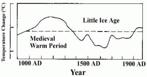
I've looked at the 1979 edition, and Figure 45 is the one. It has a curve, but with the 20th century warmer than the MWP!! It is said to be based on Lamb (1969). This is a chapter in the World Survey of Climatology Series edited by Landsberg. I can't see how you can adapt anything from this. Hubert's chapter has lots of detail, many figures which have lines with the phrase 'analyst's opinion' - one of his favourite terms for things he made up. If it is an adaptation, then it comes from Hubert's ideas about England and NW Europe, because these are the curves in the 1969 chapter. [Phil Jones]
Flashback: THE HOCKEY SCHTICK: Deja Vu '72?
UPDATE: Dr. [Hubert] Lamb was also the source of the paleoclimate graph used in the 1990 & 1995 IPCC reports which shows an inconvenient hotter Medieval Warming Period than the present. The following IPCC report threw away Dr. Lamb's graph in favor of Michael Mann's hockey stick graph, which served to eliminate the Medieval Warming Period. This was the purpose of Mann's hockey stick, as stated in the climategate emails, to eliminate or "contain the MWP" according to Mann.


No comments:
Post a Comment