Showing posts with label graphs. Show all posts
Showing posts with label graphs. Show all posts
Thursday, August 08, 2013


Thursday, July 18, 2013
Another inconvenient graph for warmists: Eau Claire, WI hit 90+ F. much more often for decades before 1953 than it has since then
Historic 90+ days: MSP STC EAU

AND HERE IS A LOOK AT ALL THE 90+ DAYS FOR EAU CLAIRE, WI SINCE 1893. [The link above features 3 graphs; below is one]
Monday, May 13, 2013
Do NOT miss this graph: If the Earth just hit 400ppm for CO2 for the first time in millions of years, how do we explain all these readings over 400ppm from the 1800s and later?
I think skeptics should question any claims that CO2 was stable around 280ppm at any point in the last few hundred years.
Callendar, Jaworowski and Beck, who is believable? | Tallbloke's Talkshop

CO2: The Greatest Scientific Scandal of Our Time: Dr Zbigniew Jaworowski's criticism's of the assumed reliability of IPCC graphics merging pre-industrial CO2 data from ice cores with atmospheric measurements from 20C
Callendar, Jaworowski and Beck, who is believable? | Tallbloke's Talkshop
CO2: The Greatest Scientific Scandal of Our Time: Dr Zbigniew Jaworowski's criticism's of the assumed reliability of IPCC graphics merging pre-industrial CO2 data from ice cores with atmospheric measurements from 20C
...glaciological studies are not able to provide a reliable reconstruction of CO2 concentrations in the ancient atmosphere.
...Formation of CO2 clathrates starts in the ice sheets at about 200 meter depth, and that of O2 and N2 at 600 to 1000 meters. This leads to depletion of CO2 in the gas trapped in the ice sheets. This is why the records of CO2 concentration in the gas inclusions from deep polar ice show the values lower than in the contemporary atmosphere, even for the epochs when the global surface temperature was higher than now.
... An ad hoc assumption, not supported by any factual evidence[3, 9], solved the problem: the average age of air was arbitrary decreed to be exactly 83 years younger than the ice in which it was trapped...The notion of low pre-industrial CO2 atmospheric level, based on such poor knowledge, became a widely accepted Holy Grail of climate warming models.
...
Improper manipulation of data, and arbitrary rejection of readings that do not fit the pre-conceived idea on man-made global warming is common in many glaciological studies of greenhouse gases.
Saturday, April 20, 2013
Visualizing The Antarctic Death Spiral
Real Science
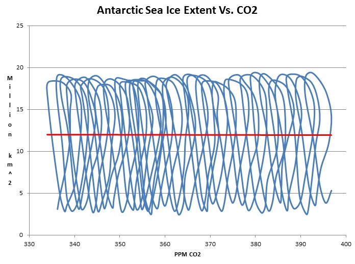
The graph below plots Antarctic sea ice extent vs. atmospheric CO2 on a month by month basis.
Never has the death spiral been so clear.
Thursday, March 07, 2013

Tuesday, March 05, 2013
Don't miss this graph and conclusion: "there is no evidence so far that climate change has increased the normalized economic loss from natural disasters"
Roger Pielke Jr.'s Blog: Graph of the Day: Global Disasters and GDP
Data from Munich Re and United Nations. The graph shows a ratio of weather-related disaster losses to global GDP expressed in 2011 dollars and calculated at market exchange rates.
...
They conclude: "there is no evidence so far that climate change has increased the normalized economic loss from natural disasters."

Sunday, February 24, 2013
Graph shows changes in atmospheric carbon dioxide seem to follow temperature changes (not the other way around)
Reader DB writes:
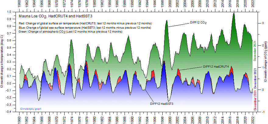
I came across a graph of land/sea temperature changes and atmospheric CO2 changes for the past 5 decades (below) , which appears to be devastating to the CO2-centric theory of warming. Am I reading it wrong?From Climate4you:
Pachauri thinks it'll take another 13-23 more years--in addition to the past 17--to determine whether their crumbling catastrophic AGW theory is a bomb.
But I think all he needs to do is look back at their own datasets over the past 54 years (datasets the IPCC supposedly rely upon for their Assessment Reports) of land/sea temperature changes and atmospheric CO2 changes, and he should be able to see what I am seeing--which phenomenon occurs first--changes in atmospheric carbon dioxide seem to follow temperature changes (not the other way around). Even adding in the newest (adjusted) HadCRUT4 dataset still doesn't help them...
Friday, February 01, 2013

Thursday, May 17, 2012
Bastardi tweets some graphs: "How do you not look at this and at least have doubt about co2 caused warming"
Twitter / @BigJoeBastardi: @HeartlandInst @MarkJWeath ...
@HeartlandInst @MarkJWeather ex:. How do you not look at this and at least have doubt about co2 caused warming #ICCC7 pic.twitter.com/H4CdO3WB

Wednesday, June 16, 2010
Roger Pielke Jr.'s Blog: Climate Change Catnip
...As the graph above shows (from data of the NWS), there is no evidence for an increase in flood disasters. In fact, there has been a marked decrease.

Sunday, April 18, 2010
One graph illustrates both the stupendous failure of Al Gore's climate hoax AND the rise of climate realism
Google Trends: "climate crisis", "watts up with that"

[Flashback to April 1, 2008; note that point on the graph above]: Gore to recruit 10m-strong green army | Environment | The Guardian

[Flashback to April 1, 2008; note that point on the graph above]: Gore to recruit 10m-strong green army | Environment | The Guardian
During the next three years, his Alliance for Climate Protection plans to spend $300m (about £150m) on television advertising and online organising to make global warming among the most urgent issues for elected American leaders.
...
Environmental activists yesterday described the plan as the most ambitious public campaign launched in the US.
"The resources are completely unprecedented in American politics," said Philip Clapp, of the Pew Environment Group.
...
"This climate crisis is so interwoven with habits and patterns that are so entrenched, the elected officials in both parties are going to be timid about enacting the bold changes that are needed until there is a change in the public's sense of urgency in addressing this crisis," Gore said. "I've tried everything else I know to try. The way to solve this crisis is to change the way the public thinks about it."
Friday, April 02, 2010

Friday, January 01, 2010
Runaway Global Warming - Has Arrived pt 2 : Environment - Page 73

Is it possible for anyone to discern from this particular graph of ice core temperature data where anything remotely resembling something the earth hasn't seen, and recovered from, before, is actually happening?
Sure looks to me like prior "runaway warming" was alot worse in terms of temperature than anything seen to date without some horrendous extrapolation which certainly is not in evidence.
Sunday, October 25, 2009


Friday, July 03, 2009
An inconvenient graph
AdaEveningNews.com - Ada, Oklahoma
 [Via Climate Realists]
A graph taken from Alan Carlin’s report. The solid line illustrates global temperatures were decreasing during this period, while the dotted line shows carbon dioxide levels were increasing.
[Via Climate Realists]Friday, May 01, 2009
Skeptic's Corner: Spit and Pie Charts
Now our final pie, to show how tiny carbon dioxide is in the scheme of things check this out:
This is the make up of our Earth's atmosphere. Nitrogen, Oxygen and that tiny sliver of Argon. Where is carbon dioxide and methane and all that other stuff? They are too small to be represented in a pie chart, that is why they are called trace gases.

Tuesday, April 28, 2009
Oh, the humanity
April '08: "Record 2008 Crop for Brazil"

2008 Crop Trip Report: Brazil Expected to Produce Three Record 2007/08 CropsIn looking at the graph below, I'm failing to see any evidence that small amounts of warming or CO2 devastated corn yields in recent decades. Can someone please help me out?
Brazil is forecast in 2007/08 to produce three record crops for corn, cotton and soybeans due to a combination of increased planted area and favorable weather.
Tuesday, January 27, 2009
RE: Cosmic ray scientist Sir Arnold Wolfendale: No relation between global warming and cosmic rays - A reply from Piers Corbyn | CO2sceptics

Source of Graph S. Baliunas and Willie Soon
Tuesday, December 30, 2008
Prometheus » Blog Archive » Overselling Disasters and Climate Change by Munich Re

Over the long term the loss of lives from disasters has gone down remarkably.
See the graphs here: Global Warming is Not Tied to Natural Disasters and Other Extreme Weather Phenomenon
He then talks about how COLD weather caused 1000 deaths in Afghanistan.
Subscribe to:
Posts (Atom)


 Posts
Posts


