Reader DB writes:
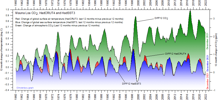
I came across a graph of land/sea temperature changes and atmospheric CO2 changes for the past 5 decades (below) , which appears to be devastating to the CO2-centric theory of warming. Am I reading it wrong?From Climate4you:
Pachauri thinks it'll take another 13-23 more years--in addition to the past 17--to determine whether their crumbling catastrophic AGW theory is a bomb.
But I think all he needs to do is look back at their own datasets over the past 54 years (datasets the IPCC supposedly rely upon for their Assessment Reports) of land/sea temperature changes and atmospheric CO2 changes, and he should be able to see what I am seeing--which phenomenon occurs first--changes in atmospheric carbon dioxide seem to follow temperature changes (not the other way around). Even adding in the newest (adjusted) HadCRUT4 dataset still doesn't help them...


15 comments:
What you're looking at there, they will say, is the CO2 feedback effect. Rising CO2 increases temperature, which releases more CO2. But anything else that raises temperature releases more CO2 as well, it's caused by the changing solubility of CO2 with temperature in the surface layer of the oceans.
The mainstream theory says the causal effects go both ways - the temperature to CO2 effect is visible in the short-term annual variations, the CO2 to temperature effect not so clearly visible.
It's interesting, and worth discussing, but it won't bother the CO2-centric theory at all.
"...the CO2 to temperature effect not so clearly visible."
It is not visible at all.
"It's interesting, and worth discussing, but it won't bother the CO2-centric theory at all."
No amount of dissenting data seems to bother CO2-centrists.
An excellent graph. However, in the new 'digital' age of 21st century science, this is hopelessly 'analog.' Trends, charts, and correleations mean nothing to those who put ultimate faith in the unseen data manipulations of computer software and the unvoiced assumptions built into computer 'models'.
Just for grins, the correlations between the different lines (CO2 vs temp)should be compared using incremental offsets of N months, just to see which value of N brings out the 'best' r-squared value. This would be a quantitative estimate of the actual time delay built into the feedback process between the cause and the effect. Even a computer could tell which was which by the sign of the N value.
Oh, you really don't get it do you?
This is what climate scientists call a negative feedback. It's called negative because the effect happens BEFORE the cause.
Simple really !
And if that doesn't work you turn the paper the other way around ;)
But seriously, most of these loons are beyond reason now. They're sure the world is going to end unless you do exactly what they tell you to do and they are not going to let anything trivial like FACTS get in the way of their crusade.
It's called negative because the effect happens BEFORE the cause.
Uncle Isaac said it all in 1948 in his paper
The Endochronic Properties Of Resublimated Thiotimoline
thiotimoline is notable due to it's unique property of dissolving before being mixed with water. This is explained by each molecule containing at least one carbon atom such that, while two of the carbon's four chemical bonds lie in normal space and time, one of the bonds projects into the future and another into the past
I suggest Dr A's not so serious paper could have been the template for so much of the output that has masqueraded as science from the climate gravy train team
The graph shows the year-on-year change in CO2 vs the y-o-y change in temperature. When temperature goes up, the oceans emit more CO2 (or absorb less). And vice versa. So the y-o-y change in CO2 lags the y-o-y change in temperature, as shown in the graph.
Unfortunately, the graph does not address the issue of whether mankind is increasing the planet's CO2 levels, or whether CO2 warms the planet. These things have smaller y-o-y differences so don't show in that graph.
A different angle is needed to disprove CAGW.
"Unfortunately, the graph does not address the issue of whether mankind is increasing the planet's CO2 levels.."
Irrelevant. Note that even though CO2 in the chart shows a near steady increase, nothing is warming. That's the end of CAGW, essentially. Besides, how would you disseminate exactly what CO2 molecule was manmade or not?
"..or whether CO2 warms the planet.."
You sure we're looking at the same chart Mike Jonas?
"You sure we're looking at the same chart Mike Jonas?"
Of course. The graph doesn't show either of those things. It shows the y-o-y changes, in which the effect of ocean temperature on atmospheric CO2 is clearly visible. But that's not enough to disprove AGW.
Like I said, you need a different angle to disprove AGW. There are plenty of them available, eg. the invalidation of the models by 15+ years of global non-warming, the tropical troposphere failing to warm faster than the surface, the inability of the models to replicate any natural climate cycle, the heavy dependence on cloud behaviour when it is not even remotely understood. And there are plenty more.
It's just that this graph, although it looks terrific, isn't one of them.
I'm guessing the graph is about percentage of change, not temperatures or CO2 levels.
Oops. Just increased magification on monitor. The legends on the side tell it. It's got PPM and temp.
"Like I said, you need a different angle to disprove AGW. There are plenty of them available, eg. the invalidation of the models by 15+ years of global non-warming, the tropical troposphere failing to warm faster than the surface, the inability of the models to replicate any natural climate cycle, the heavy dependence on cloud behaviour when it is not even remotely understood. And there are plenty more.
It's just that this graph, although it looks terrific, isn't one of them."
Nice list you rolled off there. Or, perhaps, it is the weight of them all, combined.
But, you would not agree that temps-before-CO2 is devastating to a theory that depends on CO2-before-temps--especially in combination with the laundry list above. No?
Why isolate just one? Why not the weight of all the evidence?
Tom I am pointing out something else that NiV mentioned at the top: the annual variation in CO2. There is far too much variation in the CO2 level to be caused by 'a temperature effect' of the ocean and in addition, it has the wrong sign. The CO2 goes up in winter, not down as the colder water absorbs additional gas.
What happens (I am still working on numbers) is that the huge mass of water in the air, ground and seas which freezes, including accumulated snow, kicks CO2 out of the liquid state. The amount of CO2 involved is very large. I am still trying to show that it could account for most of the 6 ppm annual variation. It looks good so far.
Note that this is not related to areas of snow and ice but to the mass (including ground moisture freezing).
Together with your observation that the warming releases additional CO2 from the water the annual cryospheric ice cycle ramps the concentration up and down 6 ppm.
I have not seen such a fine-grained chart of temp and CO2 before. Thanks for bringing it to our attention.
Crispin in Waterloo
data don't lie; people do asked "But, you would not agree that temps-before-CO2 is devastating to a theory that depends on CO2-before-temps--especially in combination with the laundry list above. No?".
It's really tempting, and the hypothesis does depend on CO2 before temps, but it is theoretically possible for it to go both ways. That's the basis of the alarmists' "tipping point". If you can demonstrate that Earth should have "tipped" before but didn't, then you can add that to the list.
BTW, I call it a hypothesis. It doesn't become a theory until it has been properly tested.
Crispin in Waterloo - here's another CO2 graph that may interest you.
http://members.westnet.com.au/jonas1/CO2Profile.jpg
It shows CO2 concentrations over a short period at various locations whose latitudes are as follows:
S Pole -90, Baring Head -41.4, Xmas Island 2, Kumukahi 19.5, La Jolia 32.9, Barrow 71.
I interpret it as showing that the biosphere (trees etc) is the major seasonal influence. The seasonal variations are bigger further north (Barrow, La Jolia) where there are the most deciduous trees absorbing CO2 like crazy in the spring and summer then releasing it in the autumn (fall).
In the far south (Baring Head, S Pole) there aren't many deciduous trees, so there's very little seasonal effect. But it does move slightly, the opposite way to the N hemisphere, which is what one would expect.
Data downloaded from scrippsco2.ucsd.edu
PS. For me, this is the real killer:
http://climate4you.com/images/GISP2%20TemperatureSince10700%20BP%20with%20CO2%20from%20EPICA%20DomeC.gif
Thank you for that graph
Post a Comment